About Project
Thiago Antonio Advogados
A tax, environmental and corporate law firm in Cuiabá. The site had to do what the legal sector rarely manages online: convey authority without looking dated. Live at tomlab.cloud/thiagoantonio.
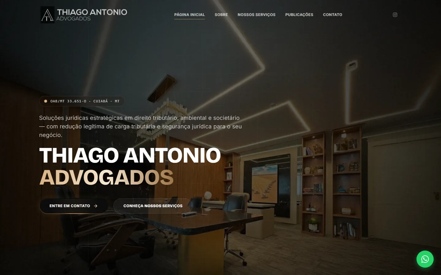
A hero built on a real photo of the office, with the name treated as a wordmark.
Role: visual direction, UX and front-end implementation.
- Sober direction using real office photography;
- Authority built through credentials and content, not clichés;
- Two contact paths with a clear hierarchy;
- A responsive interface ready to publish.
The challenge
Law firm websites tend to fall into one of two extremes: the stiff institutional one, full of scales and gavels, or the generic template that makes every firm look alike. Neither helps someone hunting for a tax specialist at eleven at night.
The direction was cinematic and sober: real photography of the office in a dark grade, gold as the single accent, and condensed uppercase type for the name. The physical space does the job the clipart would have done — and does it better, because it is true.
Decisions
-
01
Credentials instead of a slogan
Above the name, a discreet pill reading “OAB/MT 33.651-O · Cuiabá – MT”. In legal services, the bar registration number and the jurisdiction are the qualifying information — they come before any adjective.
-
02
The offer before the name
The value line — “legitimate tax reduction and legal certainty” — sits above the firm's name. People arriving want to know whether their problem gets solved here; the brand comes second.
-
03
Two paths, different weights
“Get in touch” as a solid button and “See our services” as an outline. People who have decided go straight through; people still researching have somewhere to continue without leaving.
-
04
Publications as authority
A publications section in the main navigation. In law, original technical writing is the social proof that replaces testimonials — which the sector, for ethical reasons, can barely use.