Real cases, decisions explained.
The problem, the design decisions, how the solution was built and what changed in the product.
Citizen service
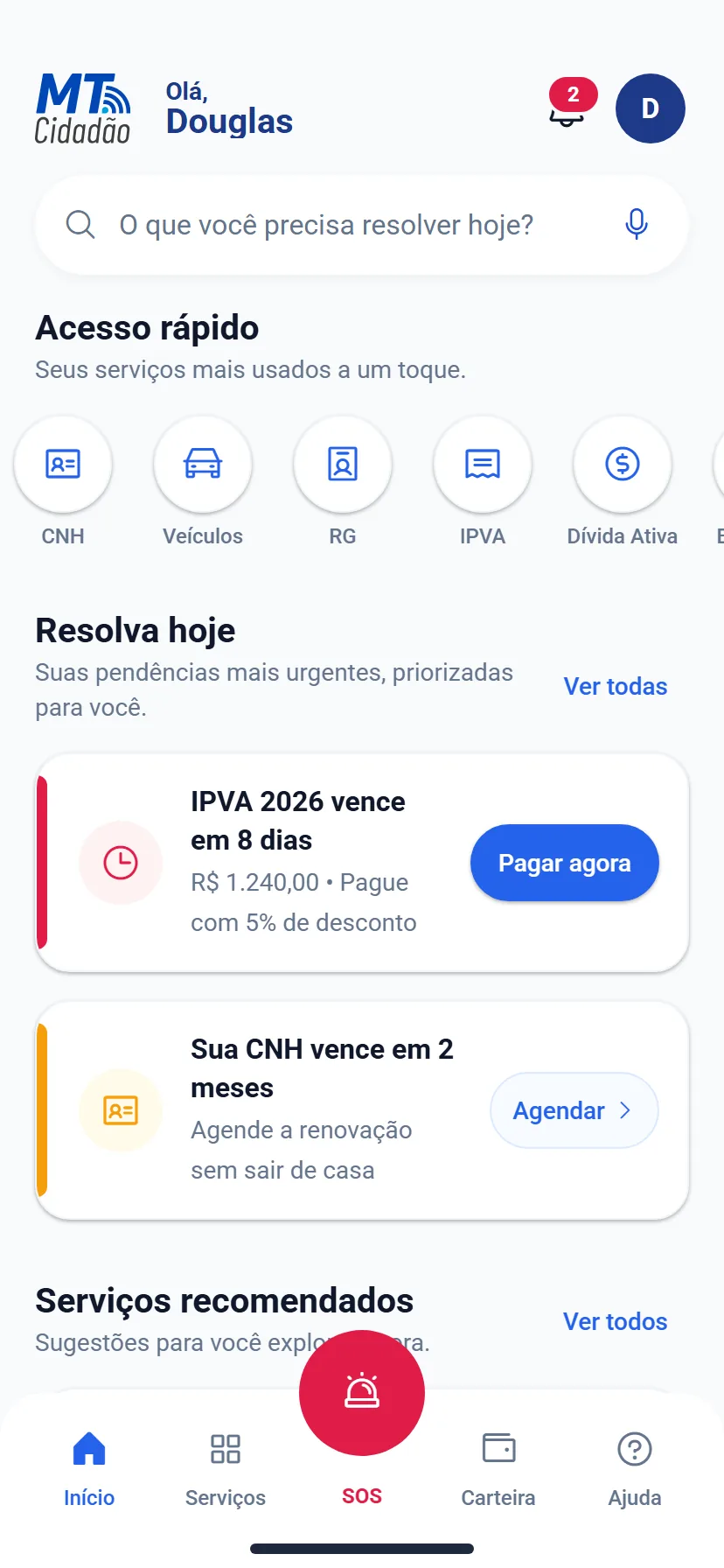
MT Cidadão 2.0
Priority services, documents and pending items in a clear mobile experience — with the brand gaining motion of its own.
See the case study
Services and portals
-
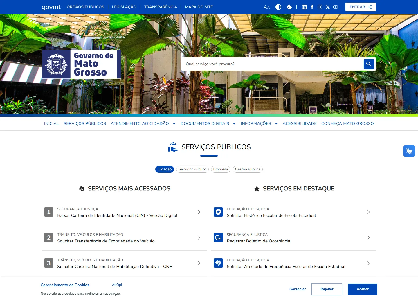
MT Services Portal Government · Prototype
Design system and accessibility in a high-traffic public product
-
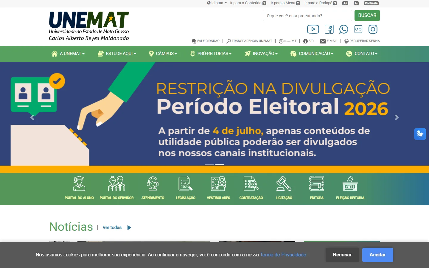
UNEMAT Government · Prototype e codificação
Audience-based navigation and accessibility for the whole community acadêmica
-

EMA Mais Educação · Prototype e codificação
Narrativa digital criada para conquistar empresas parceiras em Portugal
-
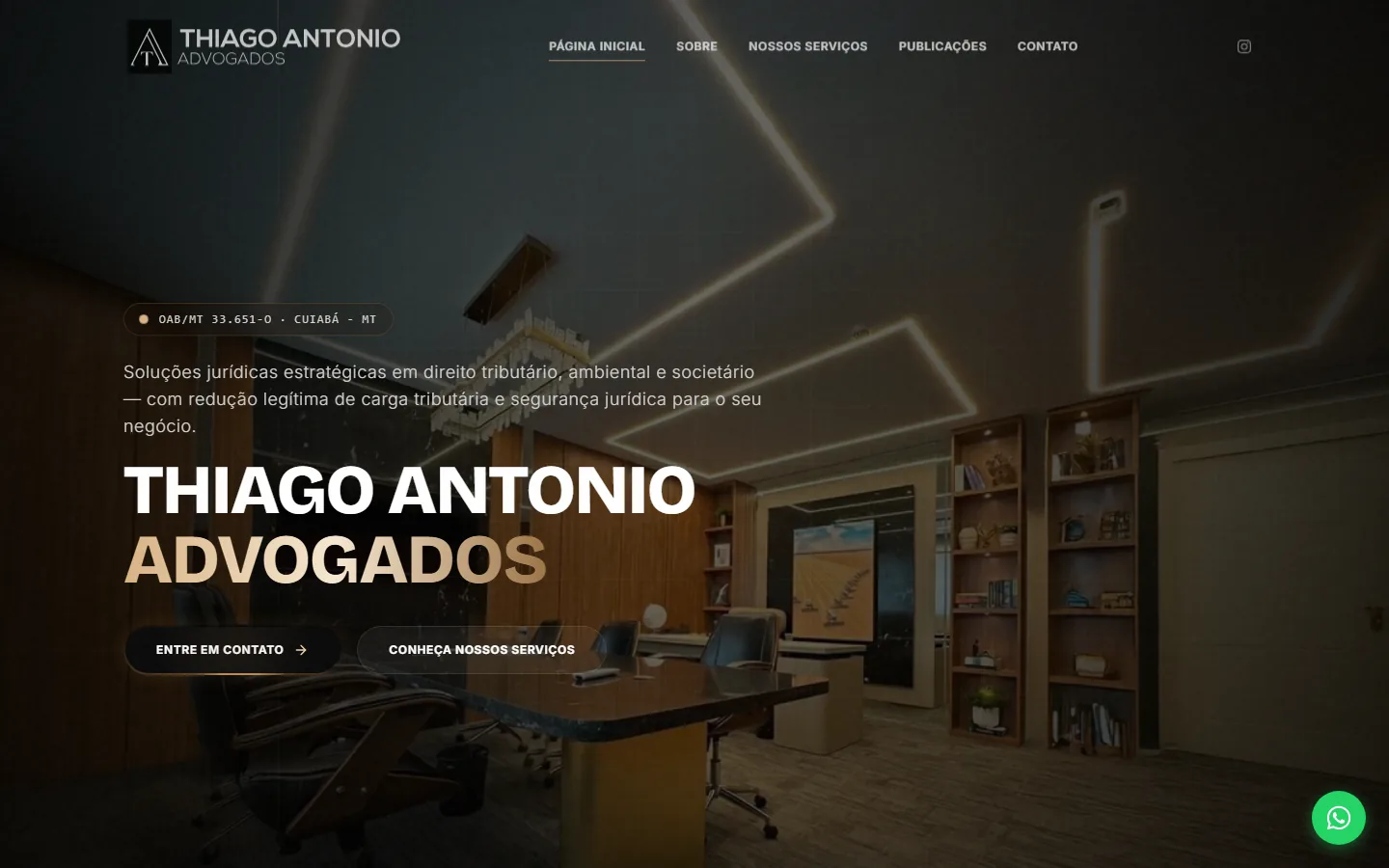
Thiago Antonio Advogados Legal · Prototype e codificação
Autoridade visual e captação qualificada para um escritório tributário
-
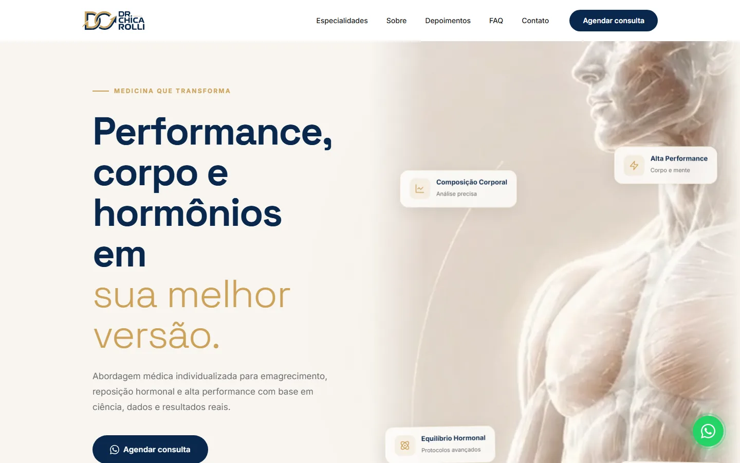
Dr. Chicarolli Saúde · Prototype e codificação
Site de conversão para clínica de medicina de performance
-
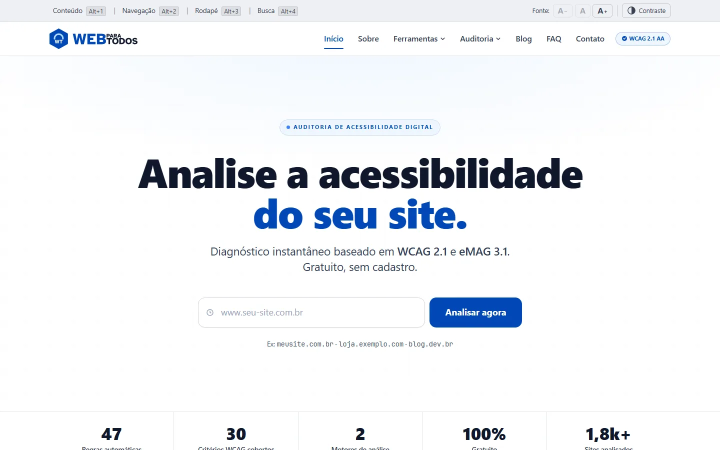
Web para Todos Produto · Do zero ao ar
Democratising the web: automated accessibility diagnostics at scale.
Branding · Brand identity
An identity doesn’t start with the logo.
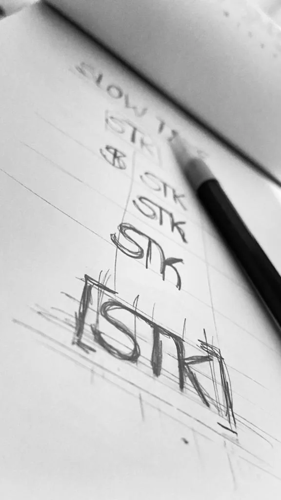
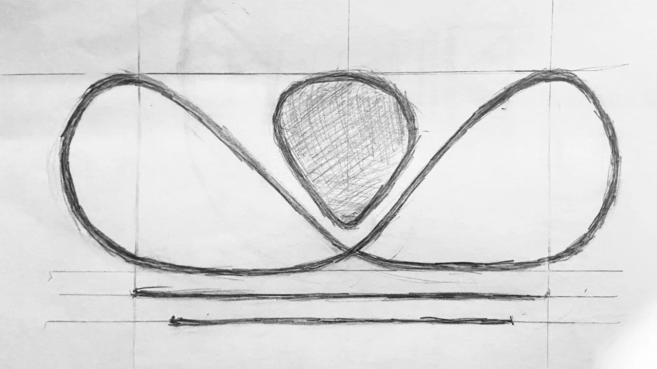
It starts with what the brand needs to stand for. Before thinking about form, I work to understand context, audience and perception. From there I explore ideas, test proportions and rule out the obvious answers until a visual language of its own emerges.
The result has to be recognisable, consistent and able to work across different contexts without losing its identity.
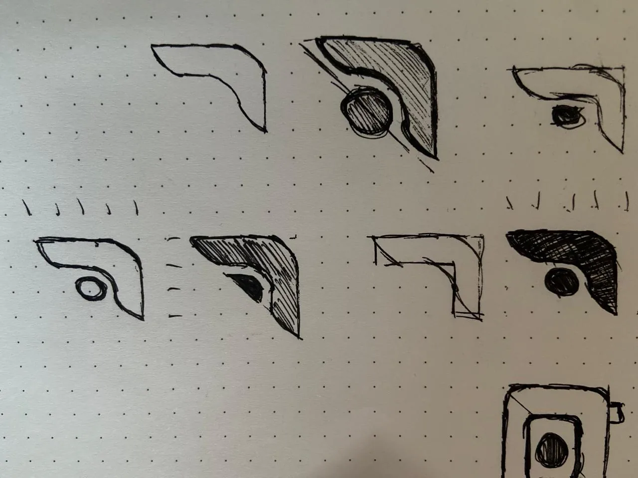
- 01
Essence
Listening, context and positioning to find what the brand needs to express.
- 02
Exploration
Hand drawings and visual directions that turn abstract ideas into forms of their own.
- 03
System
Digitisation, refinement and usage rules so the identity works beyond the logo.
Result
Brands I created
Visual systems built for different contexts, each with its own language, contrast and personality.
Instituto Carla Barbosa
Hair medicineVersions on dark and light backgrounds
Slowtake
AudiovisualWordmark and colour variation
Thiago Antonio
LegalVisual authority with positive and negative signatures